
How to Use React Material UI Date Time Picker Component in Power Apps
Following my previous post on how to use Fluent UI components in Power Apps, I thought about how I could replace the default Power Apps date picker with a modern React Material UI Date Time Picker. So after some investigation I found a React Material UI Calendar component built for the Power Apps canvas app here. This is what I was looking for! a useful date time picker component with a great look and feel! So, in this post I will show you how you can use this component in your apps and how you can replace it with the current canvas app Date Picker in Edit Form.
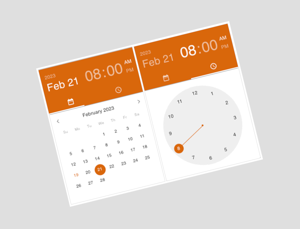
First, let’s look at the component and the result in action:
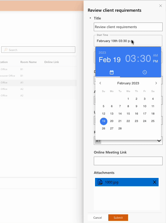
1- As you may remember from my previous post, we built a simple Canvas App and added several Fluent UI components to the app. We also added an Edit Form that opened in a Panel component and contained controls that connected to the Dataverse database. So now we want to replace Start Time and End Time controls with the React MUI Date Time Picker component.
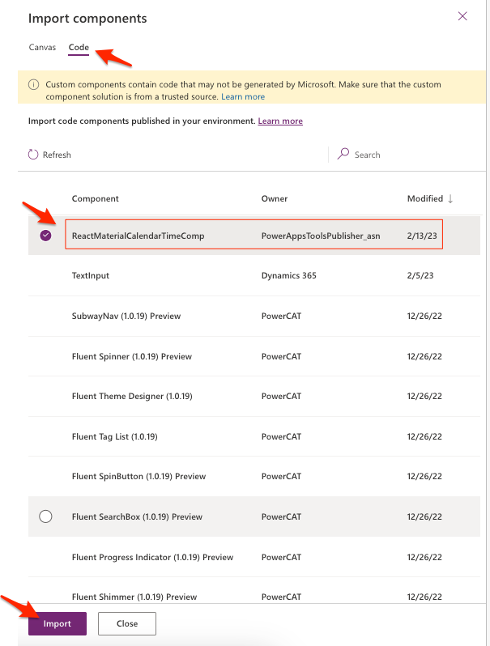
First, we need to download the React Material Component solution from here and import it to the Power Apps solutions. Then we will add this component to the app as follows:
2- Next, we will Unlock the related DataCard to each Date Time control in Edit Form, Because we need to remove some controls from DataCard and adding new Date Picker there.
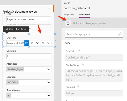
3- Next, we will remove the following controls from DataCard :
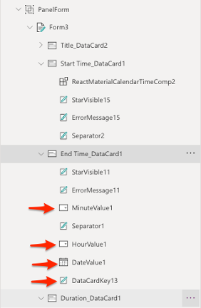
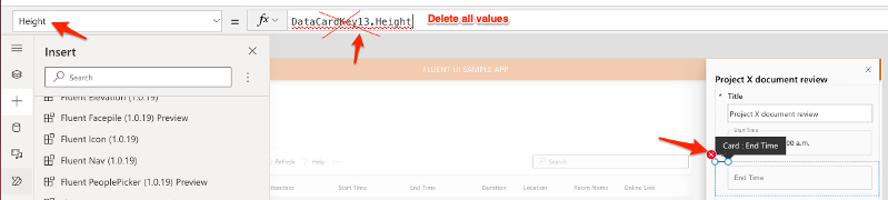
When we try to delete those controls, we will get several errors regarding the names of the deleted components in the DataCard, so you can easily delete the property values that give the error.
4- Then, we will add the ReactMaterialCalendarTimeComponent inside the selected DataCard.
5- After adding the new Material UI Date Picker component, we should set dateProperty property of this component as follows:
dateProperty: Parent.Default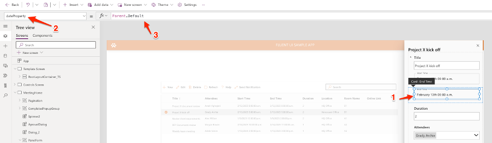
And then we should remove current Update property value of the DataCard and replace it with new value as follows:
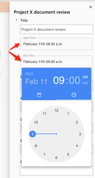
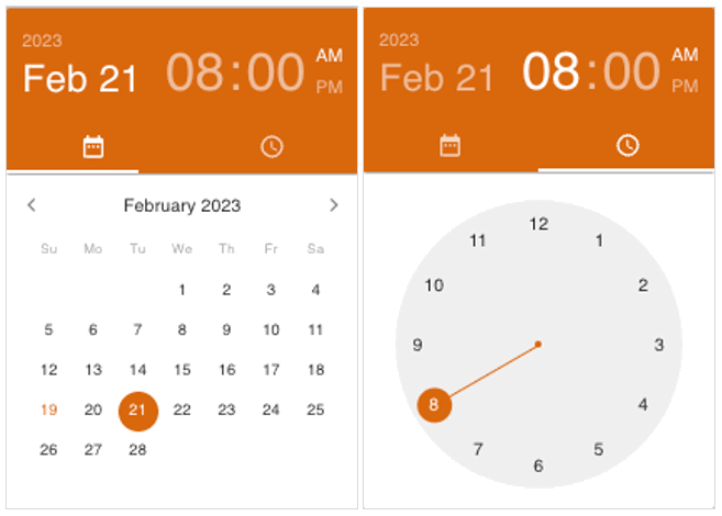
Update: ReactMaterialCalendarTimeComp1.dateProperty6- After replacing the default calendar control in both the “Start Time” and “End Time” DataCard with the React Material Date Time component, our form will look something like below.
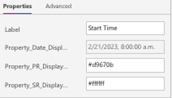
7- Lastly, there are options that allow you to customize the colors and the label of the component. I set the Label and Primary Color for Start Time field as follows.
Hope you liked this post! 🙂
This is an awesome control , anyway that we can set the font size and border on the label that displays the selected date?