
Fluent UI Details List and Command Bar Components in Power Apps Canvas App
In this post, we will learn about the components and capabilities of Creator Kit and Fluent UI to create delightful app experiences more rapidly in Power Apps.
Let’s start with an introduction to the Creator Kit and how to install it in a Power Apps environment.
What is Creator Kit?
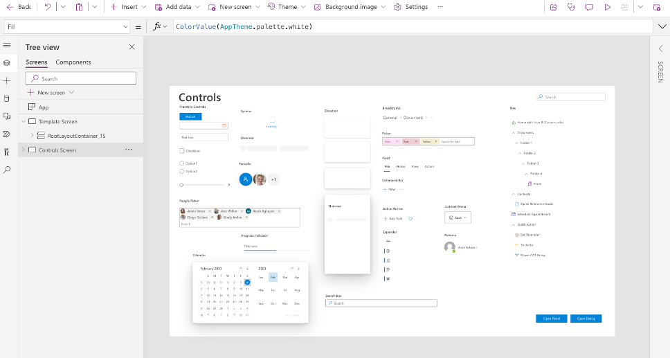
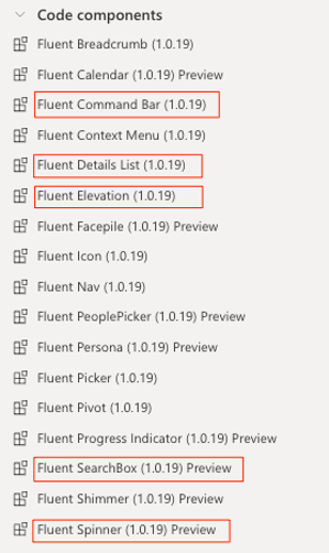
The Creator Kit, published by the Microsoft Power CAT team (Customer Advisory Team), is a collection of more than 25 Fluent UI controls and templates. All controls and components included in the kit use the Fluent UI framework to help Power Apps makers easily create consistent, beautiful, and effective user experiences for custom business applications.
Download and Install Creator Kit
Once the code components enabled, now we can download the latest version of Creator Kit Core solution from this links: https://aka.ms/creatorkitdownload
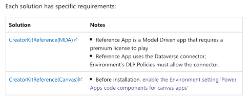
There are two optional reference solutions that I recommend you install after installing the Core solution. One of these reference solutions is for Model Driven App (MDA) and the other is for the Canvas App (Canvas), which provides Template, Reference App, and Theme Builder to help accelerate your learning with the Creator Kit.
For the purposes of this post, we’ll be using the Canvas Reference solution, which can be downloaded here: https://aka.ms/creatorkitreferencecanvas
You can also download the latest version of all managed solutions that have been tested and are ready for use here : https://github.com/microsoft/powercat-creator-kit/releases
Let’s download the packages and import them to the Power Apps environment.
1- Head over to the Power Apps Portal at https://make.powerapps.com/ and click on Solutions link at the left navigation menu.
2- Click on Import Solution button at the top of the ribbon menu.
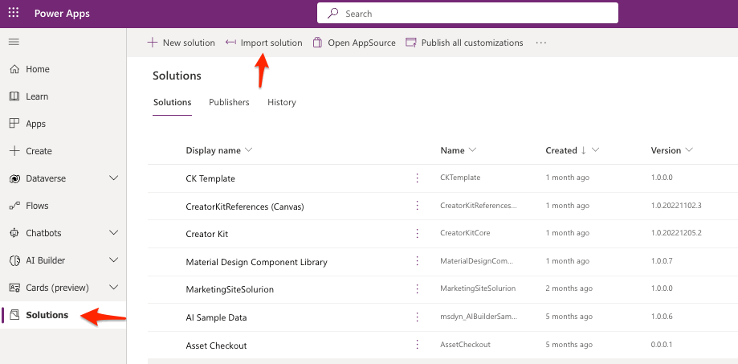
3- Click on Browse button in opened right panel and select the downloaded CreatorKitCore managed solution.
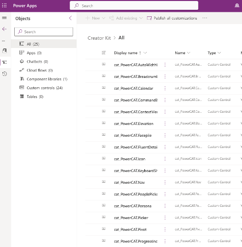
4- Once the solution is imported, let’s click on the solution to see its components:
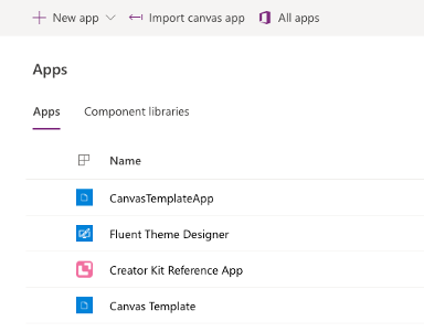
5- Next, we will import the CreatorKitCanvas solution. After opening the solution we will see these three Power Apps :
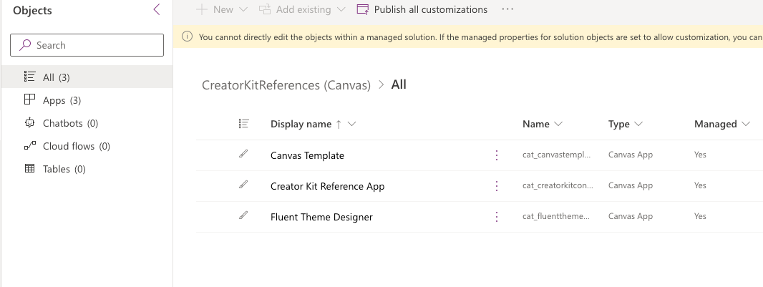
6- In the Apps list, we can also see the Canvas Apps installed by the above solution.
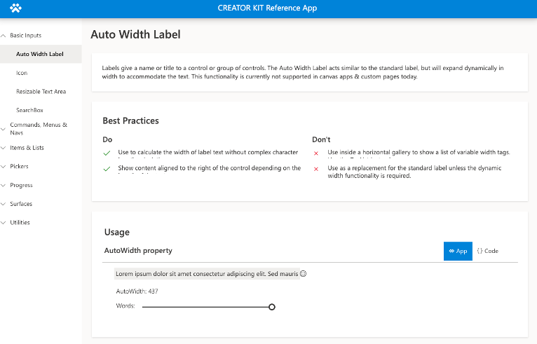
7- Let’s take a look at each App. Open the Creator Kit Reference App
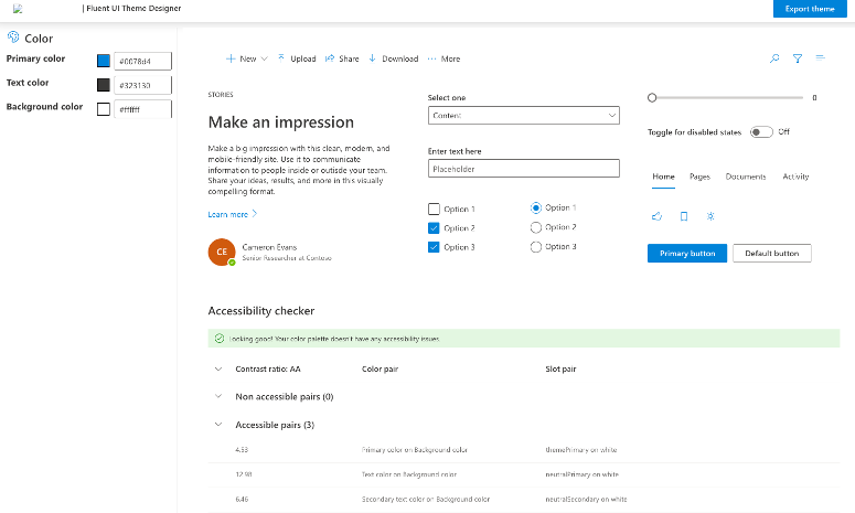
8- Open the Fluent Theme Designer App, It’s imported by CreatoreKitCanvas solution
9- Let’s edit the Canvas Template App, It’s also part of CreatorKitCanvas solution.
Building the App
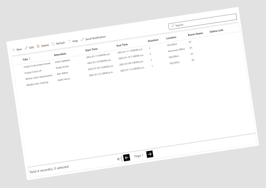
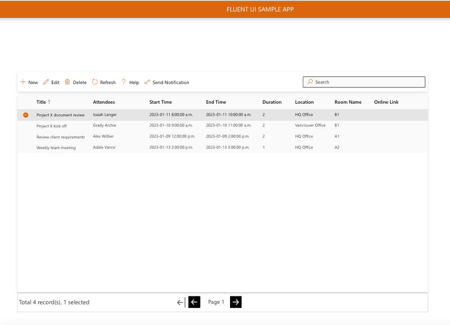
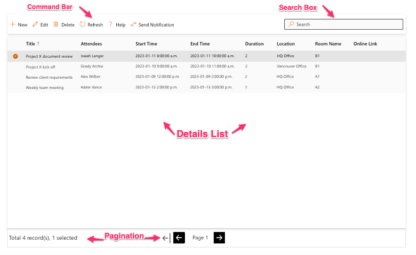
I have created a sample app for meeting booking using Fluent UI components. In this app I used Details List, Command Bar, Elevation, Header, Search Box, Panel and Spinner components. Next, I will explain how you can add and configure each component step by step.
First Let’s look at the final app :
Fluent UI Details List Component
1- Start editing the Canvas Template App and add a new screen called MeetingHome.
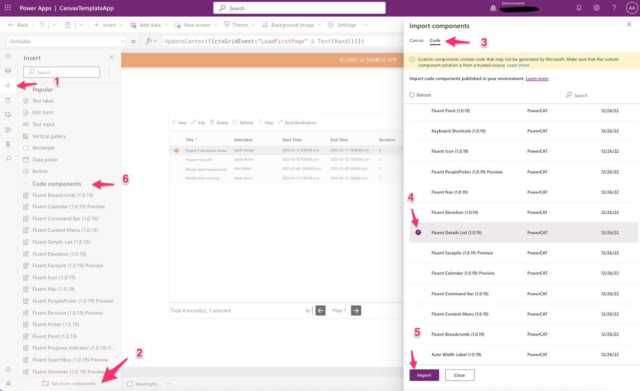
2- Next, we will import required components by using steps below :
3- Add a Dataverse Table as new data source to the App. I created a table called TBL_meeting with these columns: Title, Attendees, Start Time, End Time, Duration, Location, Room Name, Online Link, Attachments and added it to sample app.
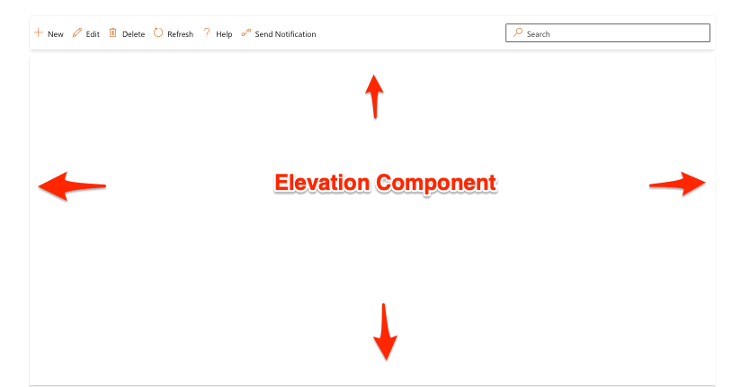
4- Next, Add a Elevation Component to the center of screen. This component will create a rectangle with shadow. It’s great to have it in backward of Details List control. I used elevation component in backward of Command Bar component as well.
5- Insert a Fluent UI Details List component, Command Bar and a Search Box component as shown below. The we will configure each component :
6- Now that we have added the Details List, we want to add columns to it, so we can see our data. First, I defined the Items property to point to the “Meeting Table” in the Dataverse.
Filter(
    TBL_Meetings,
    SearchBox2.SearchText in Title
)
7- Next, we will edit the Fields property to specify which fields the Details List has access to. Details List doesn’t automatically show all the items, and we need to define the Columns property to display.
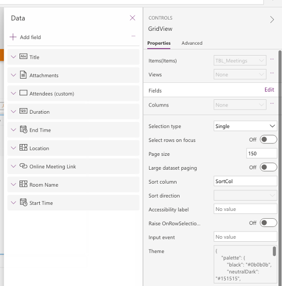
8- In order for our data to appear, we must define a Table in the “Columns” property of the Details List. Each column has certain definable properties like “Name”, “Display Name”, “Width’, “Sortable”, “Resizable”, … . A full list of these properties can be found here.
Table(
    {
        ColName: "cr9ef_name",
        ColDisplayName: "Title",
        ColWidth: 150,
        ColSortable: true,
        ColResizable: true,
        ColVerticalAlign: "Center",
        ColBolds: true
    },
    {
        ColName: "cr9ef_Attendees",
        ColDisplayName: "Attendees",
        ColWidth: 150,
        ColSortable: true,
        ColResizable: true
    },
    {
        ColName: "cr9ef_starttime",
        ColDisplayName: "Start Time",
        ColWidth: 150,
        ColSortable: true,
        ColResizable: true
    },
    {
        ColName: "cr9ef_endtime",
        ColDisplayName: "End Time",
        ColWidth: 150,
        ColSortable: true,
        ColResizable: true
    },
    {
        ColName: "cr9ef_duration",
        ColDisplayName: "Duration",
        ColWidth: 80,
        ColSortable: true,
        ColResizable: true
    },
    {
        ColName: "cr9ef_location",
        ColDisplayName: "Location",
        ColWidth: 100,
        ColSortable: true,
        ColResizable: true
    },
    {
        ColName: "cr9ef_roomname",
        ColDisplayName: "Room Name",
        ColWidth: 100,
        ColSortable: true,
        ColResizable: true
    },
    {
        ColName: "cr9ef_onlinemeetinglink",
        ColDisplayName: "Online Link",
        ColWidth: 150,
        ColSortable: true,
        ColResizable: true
    },
    {
        ColName: "cr9ef_attachments",
        ColDisplayName: "Attachments",
        ColWidth: 150,
        ColIsBold:true,
        ColCellType: "link"

    }
)
Now you can see the data in the Details List. Please note that you must use internal name of the columns in “ColName” property, and all properties names are also case sensitive.
9- Now that we have the data in Details List, we want to add Sort functionality to columns.
AddColumn, or by storing the data in a collection, automatic sorting will no longer work, and manual sorting must be implemented.Therefore if you want to implement Manual sorting for non Dataverse dataset you can follow below step, otherwise you can jump into next topic, Search Box Component.
Click on the Details List and go to the OnChange property. For the formula, enter :
If(
    Self.EventName = "Sort",
    UpdateContext(
        {
            SortCol: Self.SortEventColumn,
            SortAsc: !SortAsc
        }
    )
)
Next, change the “CurrentSortDirection” property to:
If(
    SortAsc,
    Ascending,
    Descending
)
Then change the CurrentSortColumn property to “SortCol”.
That will sort the columns based upon the context variables defined. when you click on a column heading in Ascending or Descending.
Search Box Component
The Search Box component doesn’t need to be configured. As I mentioned in step 5 above, the “Items” property in the Details List is filtered by the text values of the search box.
Filter(
    TBL_Meetings,
    SearchBox2.SearchText in Title
)
Paging Feature
Now, we are going to implement Pagination for the Details List component. The final result should be something like this :

1- First we start from the Records section. Add a Label control to the bottom of screen and replace the Text property of Label control with this code : (GridView is the name of Details List control in my app)
"Total " & GridView.TotalRecords & " record(s), " & Text(CountRows(GridView.SelectedItems)+0) & " selected"
2- Next, we will implement the Pagination controls and functionality. Add three Images and one Label controls to the screen and put their names as follows and then select all together as a Group :
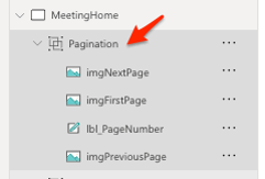
Then modify the controls properties as following table :
| OnSelect | Image | |
| img_NextPage | UpdateContext({ctxGridEvent:”LoadNextPage” & Text(Rand())}) | “data:image/svg+xml;utf8, “&EncodeUrl(” <svg xmlns=’http://www.w3.org/2000/svg’ width=’16’ height=’16’ fill=’currentColor’ class=’bi bi-arrow-right-square-fill’ viewBox=’0 0 16 16′><path d=’M0 14a2 2 0 0 0 2 2h12a2 2 0 0 0 2-2V2a2 2 0 0 0-2-2H2a2 2 0 0 0-2 2v12zm4.5-6.5h5.793L8.146 5.354a.5.5 0 1 1 .708-.708l3 3a.5.5 0 0 1 0 .708l-3 3a.5.5 0 0 1-.708-.708L10.293 8.5H4.5a.5.5 0 0 1 0-1z’/></svg>”) |
| img_PreviousPage | UpdateContext({ctxGridEvent:”LoadPreviousPage” & Text(Rand())}) | “data:image/svg+xml;utf8, “&EncodeUrl(” <svg xmlns=’http://www.w3.org/2000/svg’ width=’16’ height=’16’ fill=’currentColor’ class=’bi bi-arrow-left-square-fill’ viewBox=’0 0 16 16′><path d=’M16 14a2 2 0 0 1-2 2H2a2 2 0 0 1-2-2V2a2 2 0 0 1 2-2h12a2 2 0 0 1 2 2v12zm-4.5-6.5H5.707l2.147-2.146a.5.5 0 1 0-.708-.708l-3 3a.5.5 0 0 0 0 .708l3 3a.5.5 0 0 0 .708-.708L5.707 8.5H11.5a.5.5 0 0 0 0-1z’/></svg>”) |
| img_FirstPage | UpdateContext({ctxGridEvent:”LoadFirstPage” & Text(Rand())}) | “data:image/svg+xml;utf8, ” & EncodeUrl(” <svg xmlns=’http://www.w3.org/2000/svg’ width=’16’ height=’16’ fill=’currentColor’ class=’bi bi-arrow-bar-left’ style=’color:#615f5f’ viewBox=’0 0 16 16′> <path fill-rule=’evenodd’ d=’M12.5 15a.5.5 0 0 1-.5-.5v-13a.5.5 0 0 1 1 0v13a.5.5 0 0 1-.5.5zM10 8a.5.5 0 0 1-.5.5H3.707l2.147 2.146a.5.5 0 0 1-.708.708l-3-3a.5.5 0 0 1 0-.708l3-3a.5.5 0 1 1 .708.708L3.707 7.5H9.5a.5.5 0 0 1 .5.5z’/> </svg>”) |
Lastly, For the PageNumber, replace its Text property with this code :
"Page " & GridView.PageNumberFluent UI Command Bar Component
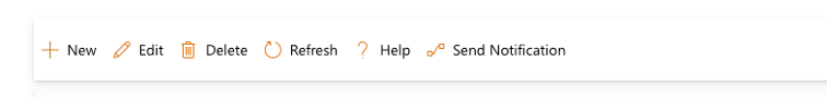
The next step will be to add a Command Bar component. We want to have Add, Edit, Delete, Refresh, Help and Send Notification buttons.
1- Navigate to “Code Components” section and add the “Fluent Command Bar” to the screen. Position it just above the Details List as shown in Step 4.
2- To configure and define the buttons, we’ll need to create a table on the Items property of the Command Bar. We need to define three properties for each item: ItemKey, ItemDisplayName and ItemIconName.
3- The ItemIconName property is in accordance with Fluent UI Icon Names, All the icon names can be found here.
Table(
    {
        ItemKey: "new",
        ItemDisplayName: "New",
        ItemIconName: "Add"
    },
    {
        ItemKey: "edit",
        ItemDisplayName: "Edit",
        ItemIconName: "Edit"
    },
    {
        ItemKey: "delete",
        ItemDisplayName: "Delete",
        ItemIconName: "Delete"
    },
    {
        ItemKey: "refresh",
        ItemDisplayName: "Refresh",
        ItemIconName: "Refresh"
    },
    {
        ItemKey: "help",
        ItemDisplayName: "Help",
        ItemIconName: "help"
    },
    {
        ItemKey: "flow",
        ItemDisplayName: "Send Notification",
        ItemIconName: "flow"
    }
)
4- Once that table has been set, you can see a Command Bar with items as shown below :
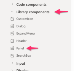
5- To define OnSelect property for each button we need to have a Form and a Panel in the App. First, we will add the Panel component that located under “Library Components” and then the Form control, It’s the standard Edit Form in PowerApps.
Once the Form has been added, choose the Data Source and Fields (TBL_Meeting in my scenario), then to lock the Form to the content area of the panel we will modify the X, Y, Width and Height properties of the Form as follows. (Panel_3 is the name of my panel control)
| X | Panel_3.ContentX |
| Y | Panel_3.ContentY |
| Width | Panel_3.ContentWidth |
| Height | Panel_3.ContentHeight |
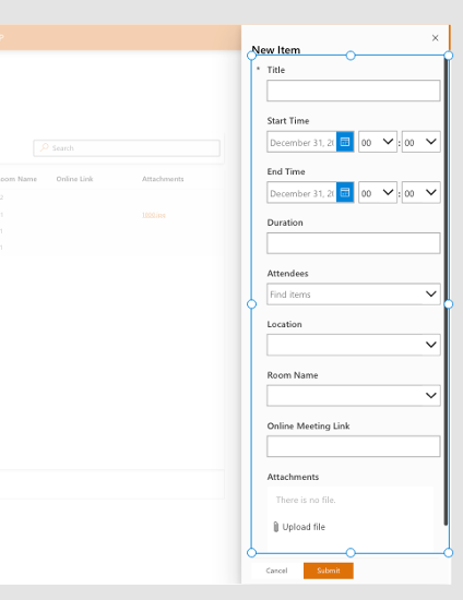
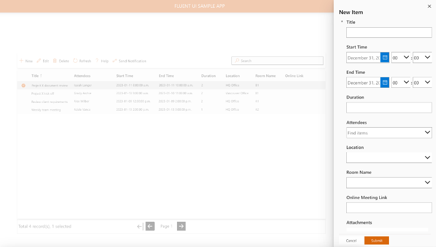
6- Next, I’m going to set some properties of the Panel components in the app. Let’s modify the Title property so that if the Form mode is NewForm, the Title will be “New Item”, otherwise it will be the title of the selected item in Details List.
If(
    Form3.Mode = FormMode.New,
    "New Item",
    GridView.Selected.Title
)
Let’s set OnCloseSelect property of the Panel with below code to update the context variable:
UpdateContext({showPanel: false}); Form3.Visible = false;Next, We will define the Submit and Cancel buttons through Buttons Property :
Table(
    {
        Label: "Cancel",
        ButtonType: 'Microsoft.CoreControls.Button.ButtonType'.Standard
    },
    {
        Label: "Submit",
        ButtonType: 'Microsoft.CoreControls.Button.ButtonType'.Primary
    }
)
Next, I want to modify OnButtonSelect property and use the Switch function to set the behavior of the Submit and Cancel buttons that are pressed by the user :
Switch(
    Self.SelectedButton.Label,
    "Submit",
    SubmitForm(Form3);
    UpdateContext({showPanel: false}),
    "Cancel",
    UpdateContext({showPanel: false})
)
Finally, we need to set the Visible property of the Panel and Form to the showPanel variable. (You can also use grouping feature to group both controls together and then set the Visible property for the group)
Last step is to set OnSelect property of Command Bar component as follows :
Switch(
    Self.Selected.ItemKey,
    "new",NewForm(Form3);UpdateContext({showPanel : true}),
    "edit",Set(varItemID,GridView.Selected.TBL_Meeting); EditForm(Form3);UpdateContext({showPanel: true}),
    "delete",Remove(TBL_Meetings,LookUp(TBL_Meetings,TBL_Meeting = GridView.Selected.TBL_Meeting)),
    "refresh",Refresh(TBL_Meetings),
    "help",UpdateContext({showHelpDialog: true}),
    "flow",UpdateContext({showNotificationDialog: true})
)
Let’s describe a little about each button actions in command bar :
New : It will set the Form mode to new Form and then update the context variable to show the panel.
Edit : It will set varItemID variable to Details List selected item ID. Then set the Form to Edit mode for editing and also show the panel. So, we also need to set the Item property of Form3 to check if the form is in edit mode then shows the selected item values. the code for Form3 Item property will be this :
If(
    Form3.Mode = FormMode.Edit,
    LookUp(
        TBL_Meetings,
        TBL_Meeting = varItemID
    )
)
Delete : It will delete the selected item by using Remove function that looked up the data source for the match item.
Refresh : It will refresh the Details List using Refresh function.
Help : shows help dialog.
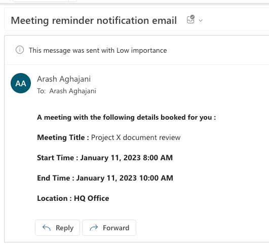
Flow : It will show Notification Dialog which contains a button to run a Power Automate flow for sending a notification email.
I intend to explain the Help and Flow next.
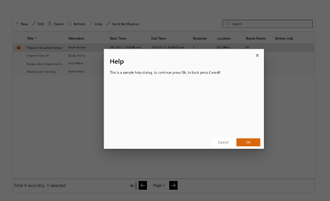
7- For the Help button, we will add a Dialog component under the Library Component to the screen. Then set this component properties as follows:
Title : “Help”
SubTitle : “This is a sample help dialog, to continue press Ok, to back press Cancel!”
OverlayColor : RGBA(0, 0, 0, 0.4)
Visible : showHelpDialog
OnCloseSelect:
UpdateContext({showHelpDialoge: false})OnButtonSelect :
If(
    Self.SelectedButton.Label = "OK",
    UpdateContext({showHelpDialog: false})
)
This was a simple scenario for the Help button. You can replace the OnButtonSelect property with your own code and desired functionality.
8- For the flow (Send Notification) button, it’s similar to the Help dialog but we need to change the buttons to run a Power Automate flow and send a notification email to the meeting participants.
For this, we need to create a Power Automate flow through Power Apps. Click on Power Automate icon in the left navigation menu and follow these steps:
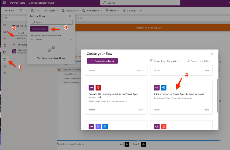
To send an email through Power Apps, select prebuilt workflow template called “Click a button in Power Apps to send an email”.
Then in the next form enter a name for the flow and click Next and then click the Create Flow button.
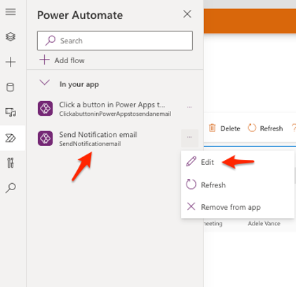
After a while a flow is created and appears in Power Automate list. Let’s click on the eclipse menu at the right side of flow and select Edit to edit the flow.
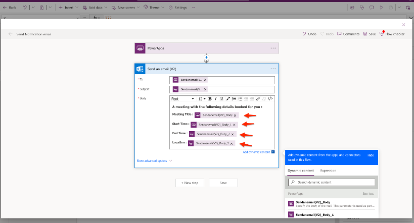
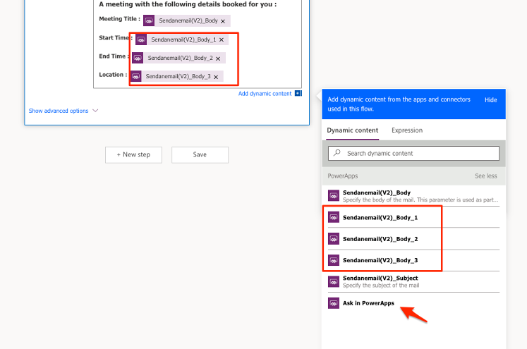
A popup dialog will be open, and we will add the desired message in the body of email. The default variables are three, To, Subject and Body. So I added three additional variables names Body_1, Body_3, Body_3 by clicking the “Ask in PowerApps” in Dynamics Content menu.
Save the changes and go back to the app.
Next, we will add a Dialog component and configure it to start the Power Automate flow. Add a Dialog component to the app and set these values for the properties :
Title : ” Send Notification”
SubTitle : ” Do you want to send a reminder email to attendees of this meeting?”
OverlayColor : RGBA(0, 0, 0, 0.4)
Visible : showNotificationDialog
OnCloseSelect: UpdateContext({ showNotificationDialog: false })
Buttons :
Table(
    {
        Label: "No",
        ButtonType: 'Microsoft.CoreControls.Button.ButtonType'.Standard
    },
    {
        Label: "Yes",
        ButtonType: 'Microsoft.CoreControls.Button.ButtonType'.Primary
    }
);
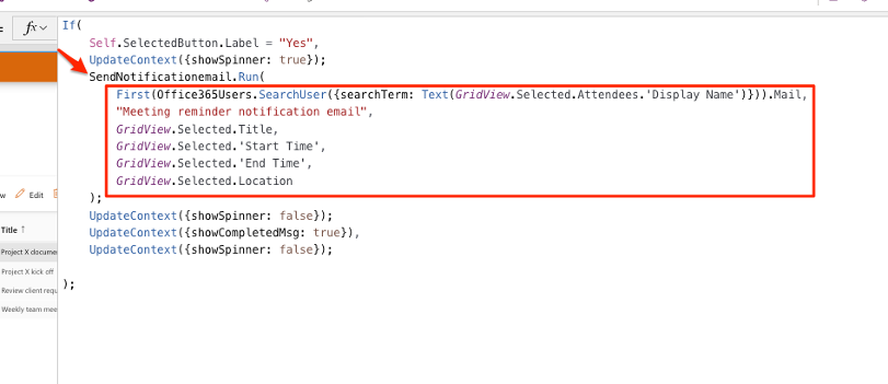
OnButtonSelect :
If(
    Self.SelectedButton.Label = "Yes",
    UpdateContext({showSpinner: true});
    SendNotificationemail.Run(
        First(Office365Users.SearchUser({searchTerm: Text(GridView.Selected.Attendees.'Display Name')})).Mail,
        "Meeting reminder notification email",
        GridView.Selected.Title,
        GridView.Selected.'Start Time',
        GridView.Selected.'End Time',
        GridView.Selected.Location
    );
    UpdateContext({showNotificationDialog: false});
    UpdateContext({showSpinner: false});
    UpdateContext({showCompletedMsg: true}),
    UpdateContext({showSpinner: false});

);
In the OnButtonSelect property we used SendNotificationemail.Run() function to pass items to flow. We had 6 variable in the flow, they are : To, Subject, Body, Body_1, Body_2, Body_3.
So we should pass 6 values to the Power Automate flow.
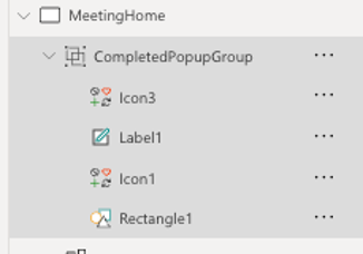
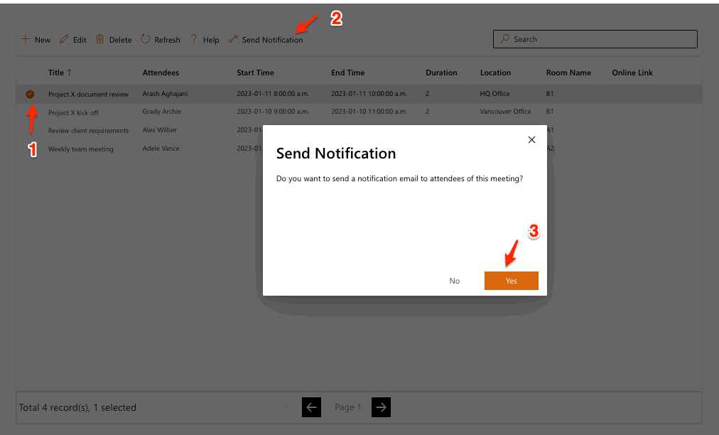
9- Once the user clicks the Send Notification button in the Command Bar, then the Notification Dialog appears and clicking the Yes button triggers the workflow! To have a nice user interface, I also used the Spinner component in the dialog. We just need to set the visibility of this control to a variable like showSpinner. Then we manage the value of the variable through OnButtonSelect of Notification Dialog that I mentioned above. I also added a group of controls to make the Completed! popup message shown to the user after the workflow process is complete! The visible property of CompletedPopupGroup is showCompletedMsg.
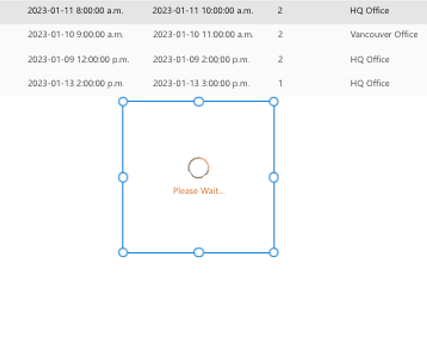
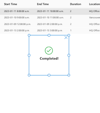
First the Spinner control appears and when the workflow task completed, then the completed! group controls will be appeared.Finally the attendees will get an email notification like follows :
This was a simple scenario of using various Fluent UI components in PowerApps, which I tried to explain to you in detail. By using these components, you can make delightful apps with great performance. I hope this article was useful for you. If you have any questions, please leave a comment.
App Source : If you would like to try this sample app in your environment, you can download the solution from here.
Hey great tutorial. Thank you 🙂
Can you maybe provide the source?
Hi Tim,
Sure! I just published the app solution on my GitHub account at following URL:
https://github.com/ArashAghajani/PowerApps-Projects/tree/main/FluentUI-DetailsList
Hello, I am using details list with SharePoint and when i am using person field i am getting data in JSON Format. Is there a way we can transform this?
Hi Sam,
Use the following function in the Items property of Details List:
AddColumns(
‘SharePoint List’,
“NewPersonField”,
CurrentPersonField.DisplayName
)
Then edit the Fields property through the properties panel and add new column “NewPersonField” to the Details List.
Finally add this new column in columns_items property as follows and remove current Person Field (JSON Format) :
{
ColName: “NewPersonField”,
ColDisplayName: “New Person Field”,
ColWidth: 150,
ColSortable: true,
ColResizable: true,
ColVerticalAlign: “Center”,
ColBolds: true
}
Does Details list control support row grouping like SharePoint lists?
Hi Enaybee,
I didn’t see that option. but I just checked the solution code in following address and seems it doesn’t support Grouped feature in Power Apps:
https://github.com/microsoft/powercat-code-components/tree/main/DetailsList
But, the React version of DetailsList is supporting :
https://developer.microsoft.com/en-us/fluentui#/controls/web/detailslist/grouped
Hi Arash,
This has been helpful as there is very little information available about Fluent UI controls. I wonder if you can help, I tried to import your solution but it errors with a dependency upon PowerAppsTools_asn (1.1).
Any advice would be greatly appreciated.
Thanks, Craig
Hi Craig,
Thanks for your feedback.
I just checked the solution and seems I used a component in the app. So to fix the issue please download and import following component:
http://themicroconsulting.com/wp-content/uploads/2021/08/PowerAppsTools_asn_1_1_managed.zip
Actually it’s Fluent UI Date Time Picker component that I explained in this article:
https://arashaghajani.com/blog/how-to-use-react-material-ui-date-time-picker-component-in-power-apps/
Arash,
Great blog, and really interesting article. I tried to download and import the sample https://github.com/ArashAghajani/PowerApps-Projects/tree/main/FluentUI-DetailsList
However I am getting a missing dependency error:
Display Name: new_sharedoffice365_24f0c Type: Cloud Flow RequiredBy: Send Notification Email
So it is like something sort of PowerAutomate reference is stopping me from importing this. Any ideas?
David
Manual sorting is not working for me. I have followed these instructions (which are almost identical to the ones at https://learn.microsoft.com/en-us/power-platform/guidance/creator-kit/detailslist#manual-sorting) but it is not working. Only one column out of 6 columns marked sortable has a header that is clickable. I don’t understand why. The items are a collection based on a SharePoint Online list.
Is there any way to add dropdown list inside detail view to update multiple row values like gallery?